Essential Elements: What Every Minimalist Landing Page Should Include
When designing a minimalist landing page, the focus should be on clarity and simplicity. The essential elements include a compelling headline that immediately communicates the value proposition to the visitor. Additionally, incorporating a succinct subheadline can further enhance understanding, guiding users on what to expect. Ensure that the primary goal of the landing page is emphasized through a prominent and visually distinct call-to-action (CTA) button, which should be easy to find and click, directing users to take the desired action.
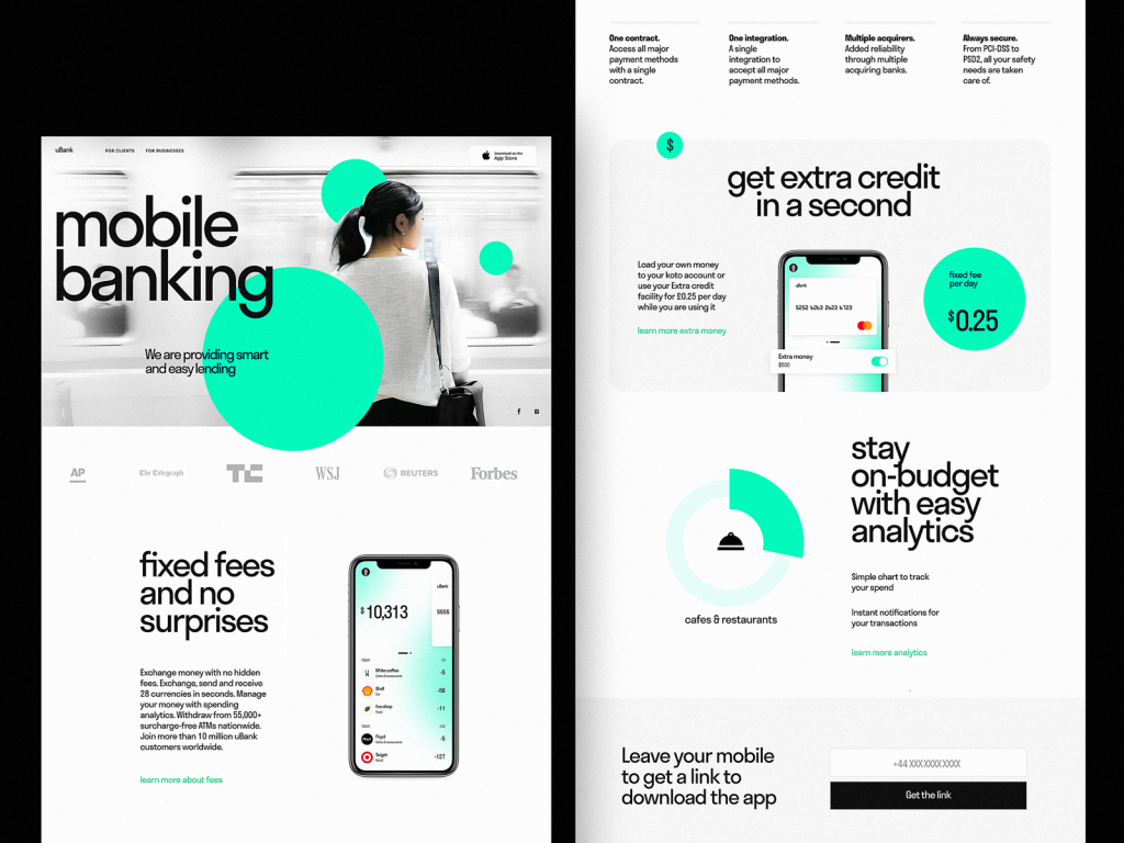
Another crucial aspect is the use of white space to create a clean layout that avoids overwhelming visitors. This allows the eye to focus on the key elements of the page. Consider including an image or video that resonates with the audience, as visuals can significantly increase engagement. Lastly, testimonials or brief customer reviews can establish credibility; even a small section displaying positive feedback can greatly impact trust and conversions.
The Power of White Space: How to Use Breathing Room Effectively
The concept of white space in design is often underestimated, yet it plays a crucial role in enhancing readability and highlighting key elements of your content. By strategically incorporating breathing room between paragraphs and other visual elements, you create a more inviting layout that encourages engagement. This empty space allows the eye to rest, making it easier for readers to absorb information and focus on what truly matters. For instance, instead of cramming text into every corner of your blog, consider leaving margins around images, using bullet points to break up text, or incorporating generous line spacing.
Effectively utilizing white space can also improve the hierarchy of your content. By varying the amount of space around different sections, you can guide readers' attention to the most important aspects of your message. For example, if you have a powerful quote or a call-to-action, framing it with ample breathing room will make it stand out significantly. Here are some tips for using white space:
- Use larger margins and padding to create a clean layout.
- Incorporate visual breaks, such as images or separators, to reduce clutter.
- Experiment with line height and font size for better readability.
Is Less Truly More? Debunking Myths About Minimalist Design
The principle of minimalist design often raises the question: is less truly more? Many believe that simplifying a design to its bare essentials enhances functionality and aesthetic appeal. However, this isn't always the case. Minimalism can sometimes lead to a stark, uninviting space that lacks personality. The key is achieving a balance where simplicity complements and enhances the purpose of the design, rather than detracting from it. This is particularly important in user interface (UI) design, where a sterile environment might leave users feeling lost rather than engaged.
Another common myth is that minimalist design equates to boring design. In reality, minimalism can be incredibly expressive and creative when done right. By focusing on a limited color palette, strategic use of whitespace, and well-chosen typography, designers can create a captivating visual narrative. Additionally, incorporating functional elements like hidden storage solutions or modular furniture can prove that simplicity does not mean sacrificing functionality or creativity. Ultimately, embracing minimalism is not about stripping away, but rather about prioritizing what truly matters in design.