The Psychology of Color: How to Choose the Right Palette for Your Website
The psychology of color plays a crucial role in how users perceive your website and can significantly impact their behavior. Different colors evoke varying emotions and associations, making it essential to choose a palette that aligns with your brand's message. For instance, blue often conveys trust and reliability, while red can create a sense of urgency. To help guide your color choices, consider creating a mood board that includes colors that resonate with your target audience and reflect the emotions you want to evoke.
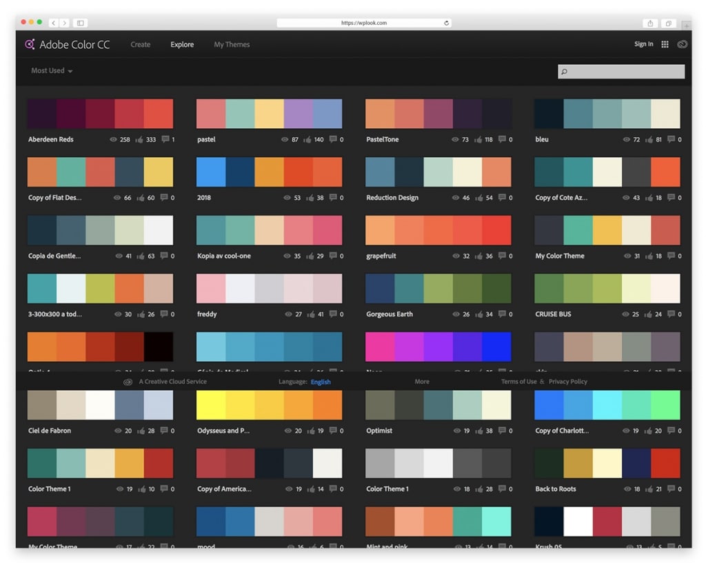
When selecting the right palette for your website, it’s helpful to understand the basics of color theory. Start by choosing a dominant color that embodies your brand, followed by complementary colors that enhance its appeal. You can also experiment with shades and tints to add depth. A useful strategy is to utilize the 60-30-10 rule, where 60% of your site is the primary color, 30% is a secondary color, and 10% is an accent color. This balanced approach ensures a visually pleasing layout while enhancing your content's readability and overall user experience.
Top 5 Color Scheme Combinations That Make Your Website Stand Out
Choosing the right color scheme is crucial for your website's success. A well-crafted color scheme not only enhances aesthetic appeal but also improves user experience by creating a cohesive visual identity. Here are the Top 5 Color Scheme Combinations that can make your website stand out and grab attention:
- Blue and Orange: This combination creates a vibrant contrast that feels modern and energetic. Blue evokes trust and dependability, while orange adds a lively touch that encourages action.
- Monochromatic Grays: A sleek and sophisticated palette using various shades of gray can make your site feel professional and timeless. This is especially effective for corporate or minimalist designs.
- Pastel Shades: Soft pastel colors like mint green, peach, or lavender impart a friendly and inviting atmosphere. This scheme works well for lifestyle, blogs, or creative portfolios.
- Black, White, and Gold: For a luxurious feel, combine the elegance of black and white with the opulence of gold. This classic color scheme is perfect for fashion or upscale brands.
- Earthy Tones: Natural colors like greens, browns, and soft beiges promote a sense of calm and are ideal for eco-friendly or health-related websites.
Are You Making These Common Color Scheme Mistakes on Your Website?
Choosing the right color scheme for your website is crucial, yet many webmasters overlook it. One of the common color scheme mistakes is using too many colors. A chaotic blend of hues can overwhelm visitors and create a jarring experience. Aim for a balanced palette with two to four main colors to maintain cohesion. Utilize tools like color scheme generators to find complementary shades that enhance readability and aesthetic appeal.
Another frequent error is failing to consider color contrast, which can severely affect user accessibility. If your text is hard to read against its background due to poor contrast, it can deter visitors from engaging with your content. Remember to test color combinations to ensure they meet accessibility standards. Tools like contrast checkers can assist in identifying combinations that ensure your site is both visually appealing and user-friendly.
